Here at HubSpot we frequently talk with customers about how they shouldn't worry as much about the design of their website as they worry about the content on their website. I believe this to be true, and when throwing Karen-Rubin.com online yesterday didn't worry so much about what it looked like. The goal is to create good, interesting content that people want to read, not win design awards.
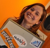
During the course of the day, I showed the site to exactly 3 people. My mom, my dad and my friend Kyle Paice, 2 of the 3 said "Ewww, you did the header in Comic Sans?" Sure enough this was the header I had used,

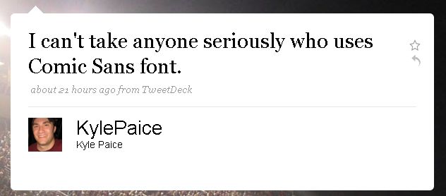
Kyle then showed me this tweet he sent earlier that same day,
Apparently I am completely behind on font etiquette. My dad sent me this article in the Wall Street Journal this morning through which I learned there has been a movement to ban the use of Comic Sans since 1999! Apparently the over used font conveys either a "fun, breezy, silly or vulgar and lazy" meaning, neither of which is exactly what I am trying to do here.
Not being a designer or a typographer, I don't know what the different fonts mean. I have changed the header to Impact, and acording to Wikipedia "Its ultra-thick strokes, compressed letterspacing, and minimal interior counterform are specifically aimed, as its name suggests, to "impact." Which, I guess, is more in line which what I am trying to do here, make an impact!
The moral of this story is to ask for advice when trying something new. Two heads (or 3 in this case) are better than one. I didn't know the message I was conveying with my font selection, but was able to find out pretty quickly. If you are launching a new site, blog, newsletter or anything else, ask a couple people you trust for their thoughts before throwing it out to the world.